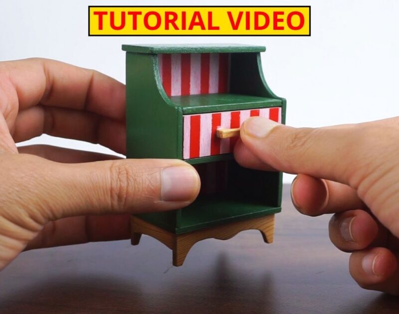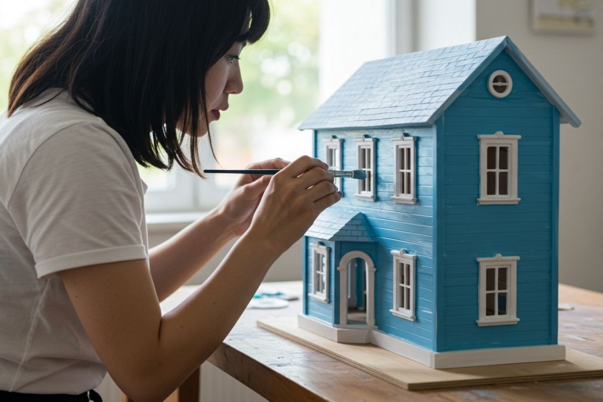
When designing a dollhouse, every tiny detail matters—especially the colors you choose. The right colors for dollhouse rooms can transform miniature spaces into cozy, elegant, or playful environments.
I rely on a set of trusted tools that help achieve professional-looking results in miniature woodworking:
- Sandpaper – to smooth edges and prepare surfaces.
- Transparent brown stain – to bring out the natural beauty of the wood grain.
- Wood oil – to protect and enhance the finish.
- Jeweler’s saw – for delicate and precise cuts.
- Small table saw – to speed up straight cuts.
- 12V mini sander – for quick, clean smoothing.
Whether you are a beginner in the world of dollhouse crafting or an experienced miniature artist, understanding how to create harmonious color schemes is essential for achieving a realistic and visually pleasing result.
Why Colors Matter in Dollhouse Design
Colors affect mood, perception, and style. Just like in real interior design, the colors for dollhouse rooms can make spaces feel larger, warmer, or more inviting. For example:
- Light shades such as pastels and neutrals create the illusion of bigger spaces.
- Warm tones like reds, oranges, and yellows bring energy and coziness.
- Cool tones such as blues and greens evoke calm and serenity.
When scaled down to miniature size, these effects are even more noticeable, which makes your color selection a powerful design tool.
Tips for Choosing Harmonious Colors
- Start with a Theme
Decide whether your dollhouse represents a modern home, a vintage cottage, or a playful children’s room. Your theme will guide your palette. - Use the 60-30-10 Rule
A classic interior design principle:- 60%: main wall color
- 30%: furniture or accent walls
- 10%: decorative details (pillows, curtains, mini paintings)
- Test Colors with Samples
Before painting, test small swatches on cardboard. Hold them against miniature furniture to see how they interact under different lighting. - Stick to Complementary or Analogous Colors
- Complementary colors: opposite on the color wheel (e.g., blue & orange) create contrast and drama.
- Analogous colors: side by side on the wheel (e.g., green, blue, teal) create calm and harmony.
- Mind the Lighting
Artificial lighting in dollhouses (LEDs or miniature lamps) may alter how colors appear. Always check your palette under the same light source you’ll use.
Popular Color Combinations for Dollhouse Rooms
- Shabby Chic Look: White, cream, soft pink, and light blue.
- Modern Minimalist: Gray, black, and neutral beige.
- Rustic Cottage: Earth tones like brown, olive green, and warm beige.
- Playful Kids’ Room: Bright yellow, sky blue, and pastel green.
Final Thoughts
Choosing the best colors for dollhouse rooms is about balance, creativity, and planning. Experiment with samples, use proven design principles, and don’t be afraid to add your personal touch. After all, a dollhouse is not just a miniature home—it’s a canvas for your imagination.